AT&T - Star OTT
I was assigned to the Billing Pod while under contract at AT&T, and the majority of my work centered around updating the billing section of the customer's AT&T account.
These projects were mostly incremental upgrades to existing designs. As such, there were many design constraints, and part of the challenge was to conform to existing design patterns while creatively solving for the problem at hand.
This project illustrates a sample of the type of work I performed while at AT&T. It is the addition of new billing data related to streaming services.
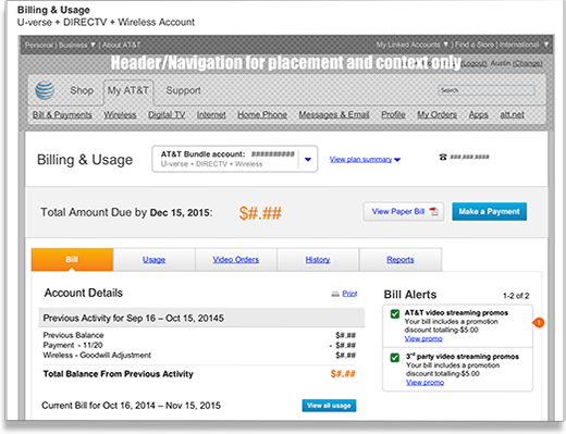
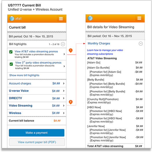
To the right, you see the addition of a new billing alert (highlighted by the orange marker) to the desktop billing page. The marker numbers coincide with a note in the larger design document.
Existing Patterns
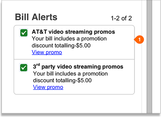
To the left, you see a close up of the alerts section on the billing page. At the time of this project, the alerts were already used extensively in the billing section. The constraints on the alerts were such things as the number of characters allowed per row, the type of icon used, and the maximum number of rows allowed.
I always worked closely with a copy writer to ensure that our content fit these design constraints.
Part of executing on a project such as this was researching and learning when to use an alert and conforming the designs of these established patterns.
Another aspect of working within the existing design constraints was that for every new project we had to consider the various views of the bill and how to accomodate them. In addition to display of the new billing items we had to consider Previous Activity and archived history.
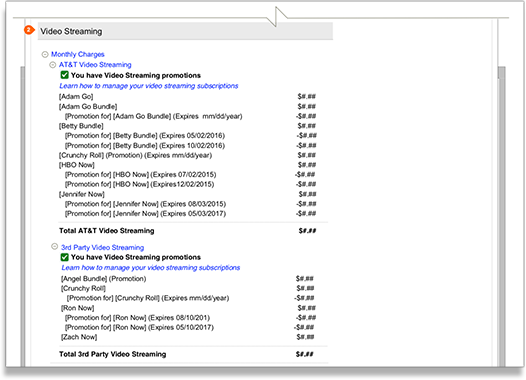
Creation of New Billing Section
To accommodate the necessary billing items for this project, we needed to create an entirely new section of the bill. This Video Streaming section was the result of careful consideration of the current bill and the other possible placements.
Aligning with Paper
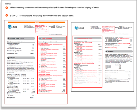
Another facet of working on the Billing Pod was aligning the digital properties with what customers see on their traditional paper bill.
All projects would necessarily include reviewing the paper bill so as to allow the digital UX team to create a reasonable facsimile for the digital copy of the billing updates.
Part of great UX is creating a cohesive and consistent experience across a customer's touchpoints with an organization. With this in mind, aligning the paper and the digital billing statements was absolutely necessary.
Mobile
With almost every project there was both a desktop component as well as a mobile component.
The new designs most always needed their mobile counterpart addressed.
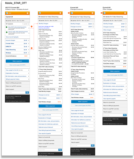
To the right, is an overview of the mobile user flow. On mobile the addition of new features became a bit more complex.
Mobile & Desktop Consistency
To the left you see a closer view of part of the mobile experience. This image shows the consistency between the desktop alerts and the mobile as well as the flow a user takes to view the new billing items.
In this case we see the addtion of the new billing alert and the flow taken when a user acts.
Overview
This overview of the Star OTT project illustrates the type of projects I encountered at AT&T. I was on a couple different pods while at AT&T and the type of projects varied widely between the Billing Pod and the Sustainment Pod.
While on the Billing Pod I focused soley on billing related projects, but while on the Sustainment Pod the work touched on all areas of AT&T digital properties.